A histogram turns a long list of numbers into something you can interpret at a glance. It groups your values into ranges, then shows how frequently each range appears. That makes it perfect when you need to understand distribution, spot outliers, or explain where most of your data sits.
Common scenarios:
- Exam scores, quality metrics, or survey ratings where you need to see how results cluster
- Web or product analytics to see the distribution of session length, order values, or customer age
- Manufacturing and operations to monitor defect sizes, cycle times, or weights against targets
- Finance and sales to check the spread of deal sizes, invoice amounts, or days to pay
- HR and people analytics to examine salary bands, tenure, or performance ratings
- Marketing to visualize email open-rate distributions or campaign ROI buckets
Below, you’ll learn how to plot a histogram in Excel, plus a faster AI option if you want to skip the setup and use plain language instead.
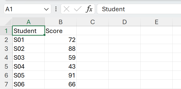
Sample data we’ll use
Paste this small dataset into a new worksheet. Put headers in row 1, then values starting row 2.
Assume:
- Names in A2:A25
- Scores in B2:B25
Built‑in Histogram chart in Excel
If you’re on Excel 2016 or newer, this is the quickest option.
- Click B2, then press Ctrl+Shift+Down Arrow to select B2:B25.
Go to Insert > Insert Statistic Chart > Histogram.
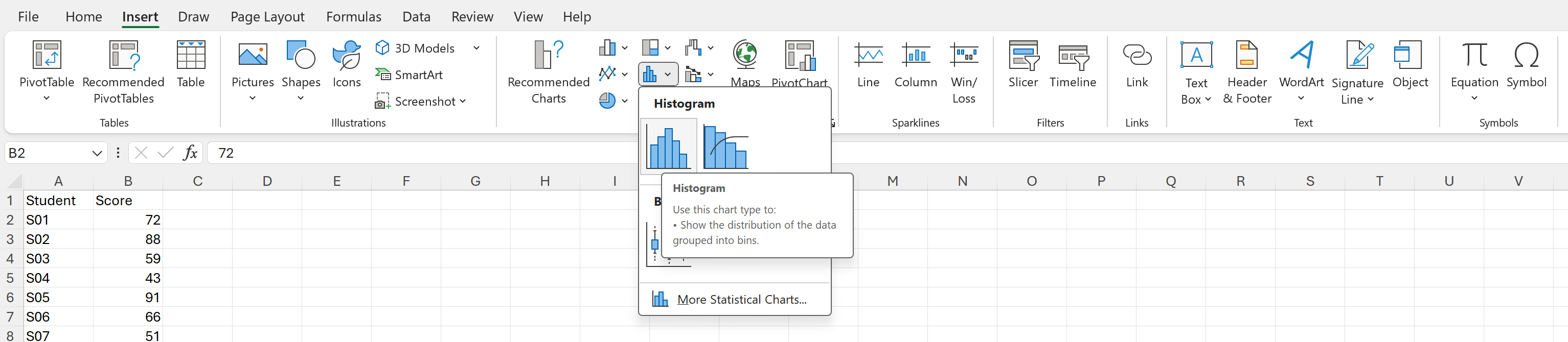
Excel will insert a histogram based on your selected scores.
- Adjust the bins to fit your story
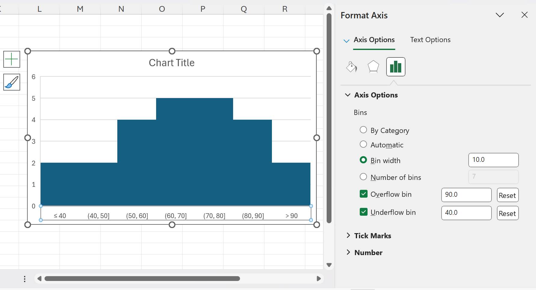
Right‑click the horizontal axis > Format Axis > Axis Options.
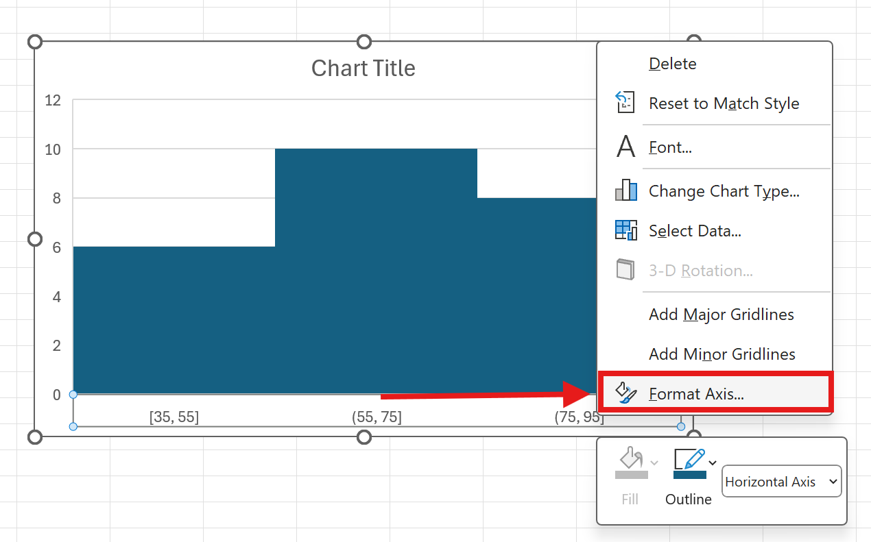
You can set:
By Category Use this when your horizontal axis contains repeated text categories and you want to group counts or sums by those categories. Automatic Excel picks binning for you using a standard rule of thumb. Bin width Set the size of each bucket. For exam scores, try 10 to create 0–10, 10–20, and so on. Number of bins Tell Excel how many buckets you want. Use either this or Bin width, not both. Overflow bin Group everything above a value, for example 90 to show a “90+” bucket. Underflow bin Group everything at or below a value, for example 40 to isolate low scores.
- Polish the chart
- With the chart selected, use the Chart Design and Format tabs to change colors, title, and labels.
- You can also add Data Labels from the Chart Elements button to display counts on each bar.
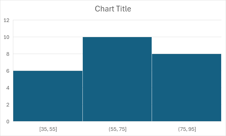
Quick example for this dataset: set Bin width to 10, Underflow to 40, and Overflow to 90 to highlight low and top performers.
Tip for text categories: If you want a category histogram, insert a helper column with the value 1 in each row, build the chart, and set bins to By Category. Excel will count or sum by repeated text entries.
Practical tips for better histograms
- Choose meaningful bin widths. For 0–100 scores, steps of 5 or 10 are intuitive. Too many bins look noisy; too few hide real patterns.
- Clean your numbers first. Convert text numbers to real numbers and handle blanks or zeros so your counts are accurate.
- Use Underflow and Overflow bins to spotlight tails, such as low performers or top outliers.
- Title your chart with the insight, not just “Histogram.” For example, “Most students score between 60 and 80.”
Want the fast, no‑formula way? Try AskExcel
For simple charts, Excel’s built‑in tools are great. When you need to do more, AskExcel lets you skip formulas and menus. Upload your Excel or CSV, describe what you want in plain language, and get a polished histogram with the right bins, labels, and insights. You can also combine steps like cleaning data, segmenting by category, or creating multiple histograms at once.
What you can do with a single prompt:
- Clean text numbers to real numbers, remove blanks, and plot a histogram of Score with bin width 10
- Create side‑by‑side histograms for Score by Class or Region to compare distributions
- Add underflow at 40 and overflow at 90, show counts and percentages, and color-code tails
- Suggest a sensible number of bins based on the data and explain the choice
- Export the chart or embed it in a report in seconds
Example AskExcel prompts you can copy:
“Create a histogram of the Score column with a bin width of 10. Add count labels and highlight bars 90 and above.”
“Plot histograms of Order Value for each Region on one canvas. Use the same bin edges so they are comparable.”
“Clean the Score column, remove blanks, then create a histogram with underflow at 40 and overflow at 90. Show both counts and percentages.”
“Suggest a good number of bins for the Age column and create the histogram with that setting.”
If you want to jump straight to the result without formulas or setup, try AskExcel now at https://askexcel.cc