When people say “add data analysis in Excel,” they usually mean turning on the Analysis ToolPak. It is a built-in add-in that gives you one-click tools for things like descriptive statistics, histograms, correlation, regression, moving averages, sampling, and more. Once enabled, you’ll see a Data Analysis button on the Data tab. Each tool asks for your ranges and options, then outputs clean tables and sometimes charts on a new sheet.
A few notes up front:
- ToolPak works on one worksheet at a time.
- Results are static. If your data changes, rerun the tool to refresh the output.
- It expects tidy numeric columns without merged cells or text mixed into numbers.
When you actually need it: common scenarios
You will turn on the ToolPak when you want fast, repeatable analysis without building everything from scratch. Typical cases include:
- Course labs and research assignments that require summary tables, correlation matrices, or simple regressions.
- Survey analysis where you need quick statistics or a histogram of responses.
- Quality control to check distributions, variability, or moving averages for process data.
- Marketing and product analytics to explore relationships between spend and revenue, or to compare campaign outcomes.
- Finance and operations to estimate trends, seasonality, and variance across periods.
- Forecasting basics using moving averages or exponential smoothing to create quick baselines.
- A/B test summaries where you want descriptive statistics and simple comparisons before deeper modeling.
- Sales performance reviews to see which inputs correlate most with results before building dashboards.
Turn it on in Windows
- Select File, then Options.
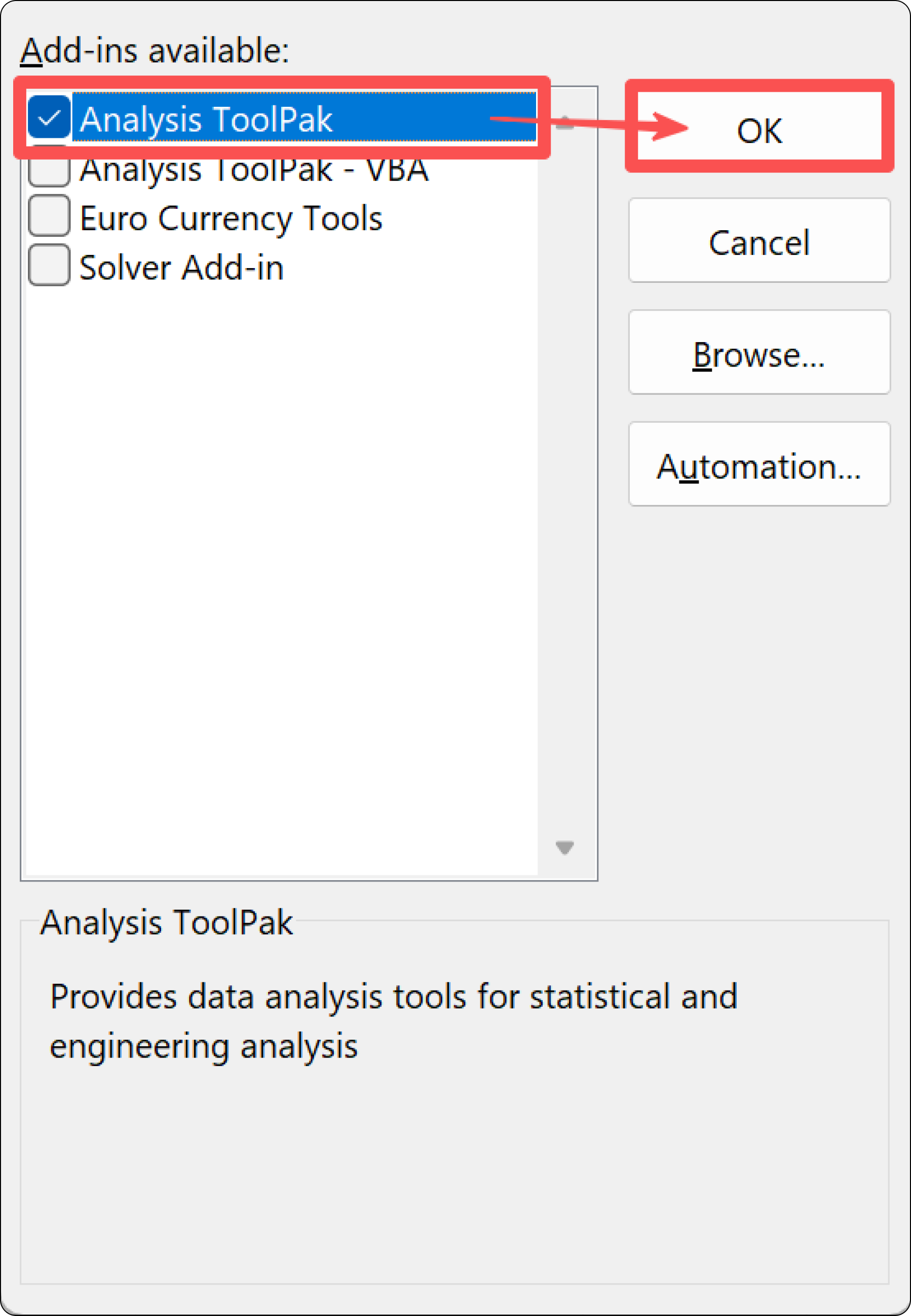
Click Add-ins, In Manage at the bottom, choose Excel Add-ins, then Go.
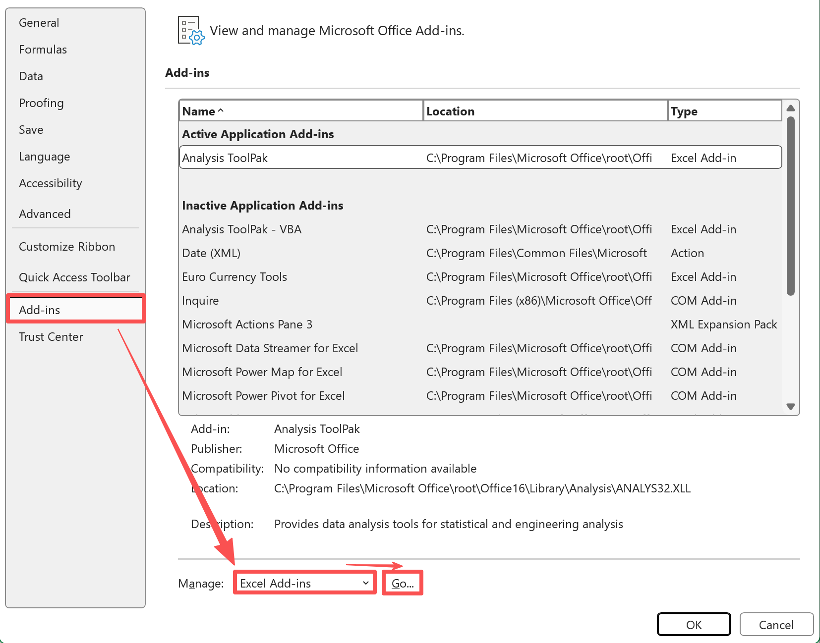
Check Analysis ToolPak and select OK.
- If you are prompted to install it, select Yes.
You should now see Data Analysis on the Data tab. If you do not, close and reopen Excel. If you still cannot turn it on, your organization may restrict add-ins, so check with IT.
Turn it on in macOS
- Go to Tools in the menu bar, then Excel Add-ins.
- Check Analysis ToolPak and select OK.
- If requested, complete the installation and restart Excel.
Look for Data Analysis on the Data tab. Excel for the web does not include the ToolPak, so use the desktop app.
Quick start example with a sample dataset
Let’s practice with a small sales and marketing dataset. Copy this into a worksheet starting at A1. Make sure there are no blank header cells.
Sample dataset
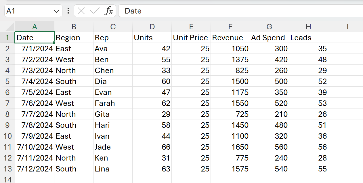
Context:
- Revenue is Units × Unit Price.
- We will summarize Revenue, look at a Units histogram, and run a quick regression using Revenue as the outcome and Ad Spend as the predictor.
Descriptive Statistics
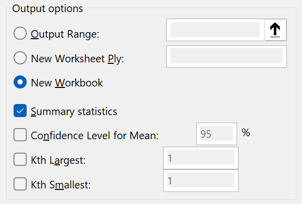
Go to Data, select Data Analysis.

Then choose Descriptive Statistics, and click OK.
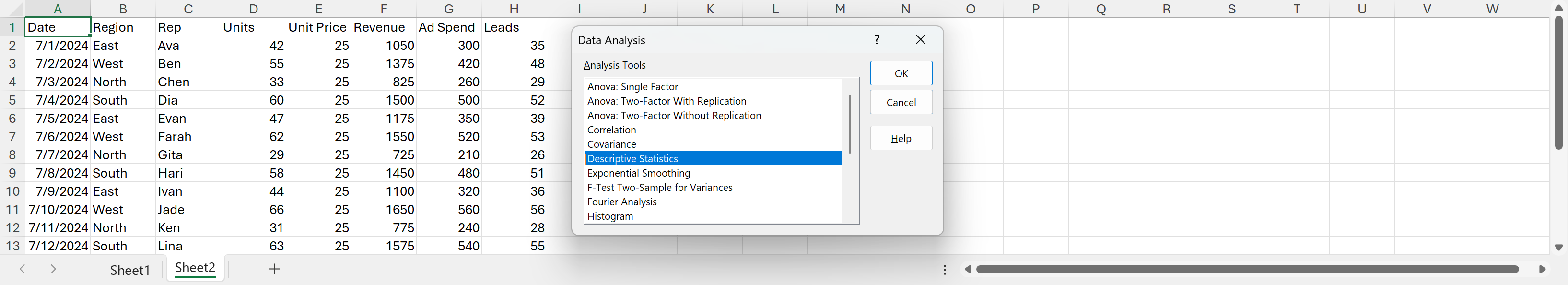
Input Range: select the Revenue column including its header. Grouped By Columns. Check Labels in First Row.

Select Summary statistics. Choose New Worksheet Ply for the output.
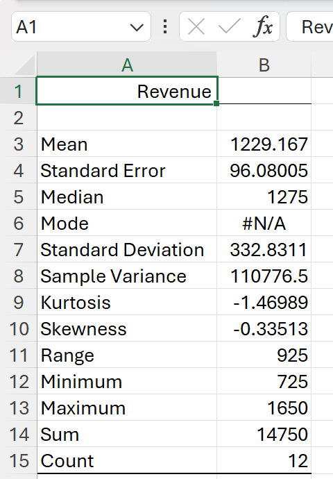
You will get count, mean, standard deviation, min, max, and more. This is a quick health check on your numeric column.
Histogram
A histogram shows the distribution of Units.
- First, create a simple bin list in an empty column, for example 20, 30, 40, 50, 60, 70.
- Go to Data Analysis, choose Histogram.
- Input Range: select Units including its header. Check Labels in First Row.
- Bin Range: select your bin numbers.
- Select Chart Output. Output to a new worksheet.
You will get a frequency table and a column chart that shows how your Units values cluster.
Regression
To see if Ad Spend explains Revenue:
- Go to Data Analysis, choose Regression.
- Y Range: Revenue including header. X Range: Ad Spend including header.
- Check Labels. Keep Confidence Level at 95%.
- Output to a new worksheet.
Read the output:
- R Square tells you how much of the variance in Revenue is explained by Ad Spend.
- The coefficient for Ad Spend shows the estimated change in Revenue for a 1 unit change in spend.
- P-values indicate whether the relationship looks statistically significant on this sample.
If your columns include text or blanks, clean them first so the tools read only numbers.
Do you still not see the Data Analysis button
Try these quick checks:
- Make sure you are in the desktop app. Excel for the web does not include the ToolPak.
- Reopen Excel after enabling the add-in.
- Confirm that Analysis ToolPak is checked under Add-ins. On Windows, use File, Options, Add-ins, Manage Excel Add-ins, Go. On Mac, use Tools, Excel Add-ins.
- Remove merged cells and convert any “numbers as text” back to numbers.
- If you are on a managed device, your IT policy might block add-ins.
Limitations to keep in mind
- Outputs are static. If your data changes, rerun the tool to refresh results.
- It works on one worksheet at a time.
- Formatting is basic. You may need to adjust labels and charts manually.
- It does not handle complex data reshaping or multi-step workflows on its own.
A simpler way for bigger questions: AskExcel
When your analysis goes beyond quick summaries, using AskExcel can be faster. Upload your Excel or CSV, then type what you want in plain language. AskExcel cleans data, aggregates, analyzes, and visualizes without you worrying about formulas or add-ins. It is great when you need to:
- Run multiple analyses in a row and keep them in sync as your file changes.
- Combine or filter data before analysis.
- Build charts and explanations together in one go.
Example AskExcel prompts
- “Summarize revenue by region and show the top 3 regions in a bar chart.”
- “Find out if ad spend is driving revenue. Run a regression and explain the results in simple terms.”
- “Create a histogram of Units and call out any unusual spikes.”
- “Calculate weekly averages for Revenue and plot the trend.”
- “Clean rows where Units or Revenue is missing, then rerun the summary.”
- “Compare average revenue per rep and flag anyone 20 percent above or below the team average.”
You can start simple and refine your request in conversation, just like you would ask a teammate.